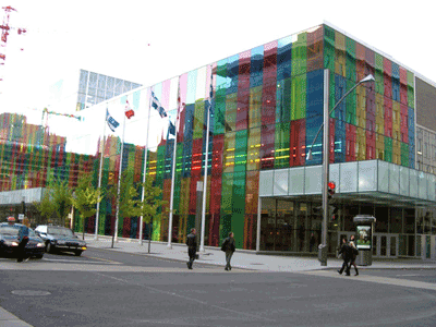
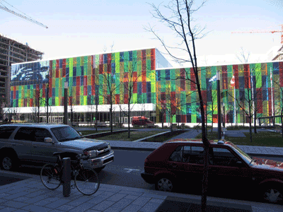
This is where the conference will be held. And here is its official website.


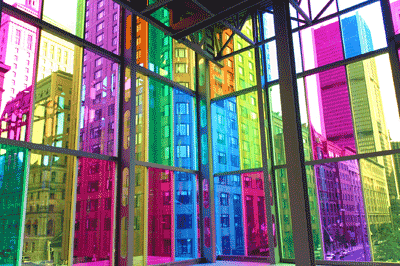
Looks nice, eh? Here’s what the company that made the laminated glass says:
Canadian architect, Hal Ingberg, has built an enviable reputation for designing buildings and installations of great perceptual richness. Ingberg’s unique perspective on the potential of glass has been lauded for its bold and unexpected examination of space, color, transparency and reflection.
For the Palais des Congrès, Ingberg envisioned a 110 meter long principle building façade constructed of sheer, transparent, multicolored glass. As light shines through the glass skin, blocks of colored light are projected onto the interior surfaces of a grand entry and dispersal hall. The space is continuously transformed as the angle of the sun changes throughout the day. Because of the dramatic size and southwest position of the wall, interior spaces—including floors, walls, staircases and escalators—are continuously swathed in vibrant dream-like hues of blue, green, yellow, and red. Outside, this wall brightens and enlivens the district linking historic Old Montreal and the contemporary downtown core.
While it is typical of modern architecture to connect interior and exterior spaces with glass, Ingberg’s design provides a unique twist on that concept. Instead of creating a condition of literal continuity between each realm, the skin’s colorful membrane creates a minimal sense of opacity that, in effect, visually establishes parallel spatial worlds. To create this unique skin, Ingberg turned to laminated glass with Solutia’s Vanceva® Advanced Solutions for Glass™
This describes the redesign / rennovation work that took place in 1999—the original Palais was opened in 1983.
Having been there, it’s not quite as nice as this makes it sound. The outside can look nice, and when the sun is shining there are colorful places inside, but the innards of the convention center were built in the early 1980s and reflects the awfulness of 1970s archiecture. When I was there in early December 2006 it was cloudy and raining, which made the place a little closed in and worn seeming. On the other hand, we have lots of space, it’s relatively compact (meaning there aren’t other conferences or activities right in the middle of us (like there was in Portland)).
The way I think of it is as a design-award winning building about a quarter of the way toward becoming an urban blight. As such, it has a certain charm to it, like a slightly too-friendly maiden aunt / bachelor uncle. When you get to OOPSLA, think about what this building has to teach us about our own discipline—software design and its realization—and what artifacts we have that are aging like this conference center is.